Significant progress was done in recent months on both sides – hardware and software. Let’s recapitulate what was done.
The UI was significantly reworked. The main focus was on user experience, but also the API has changed and is more easy to use. As the applications are getting more sophisticated, they start to rely more on UI where users can configure their behavior- and that was the primary motivation that was driving this effort.
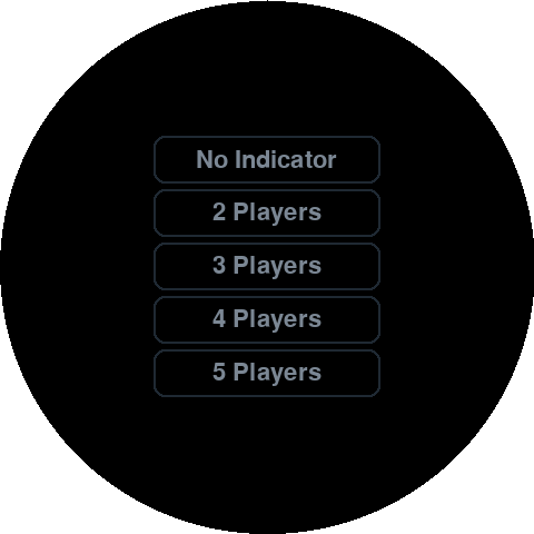
The Dice application was updated. There are no more 2 versions of it for single and double dice, but just one and it can be configured both ways through the UI. User has also the option to show a little arrow at the border – indicator of what player is on the move. This is something that helped us in the game of Catan – it happened to us repeatedly that we started to trade so eagerly that we forgot who was the last one on the move ;-).


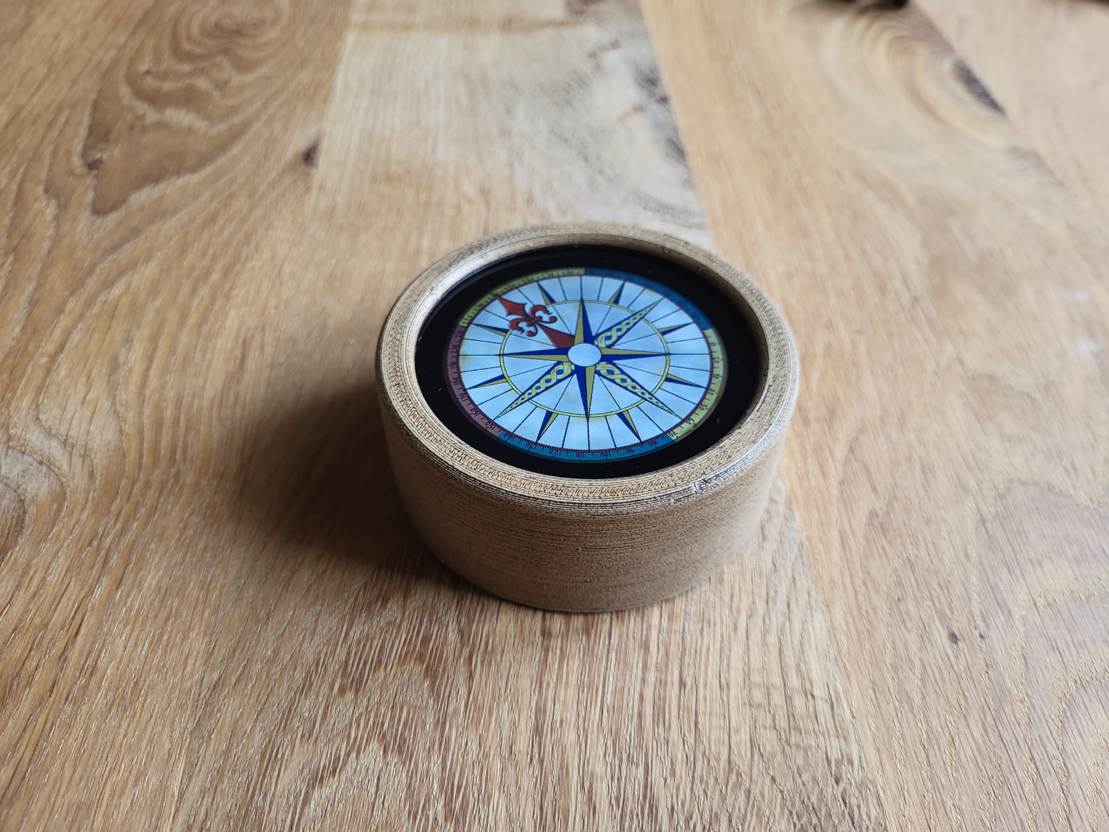
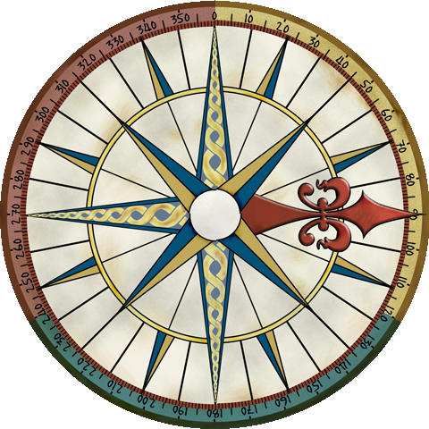
Updated was Jack’s compass. At the beginning the user can choose how many players participate and then the circle is split into corresponding number of sections – no more guesses needed when an arrow points in between players around the table.
There is also a new game – equivalent to a dice game known as “Story Cubes”.
Last but not least, hardware was significantly updated. First of all, the power module was replaced with a more modern USB-C (it was Micro USB before). The new module has a different layout and allows the connector to be placed closer to the surface and symmetrically with the main axis. It’s definitely less confusing than before.
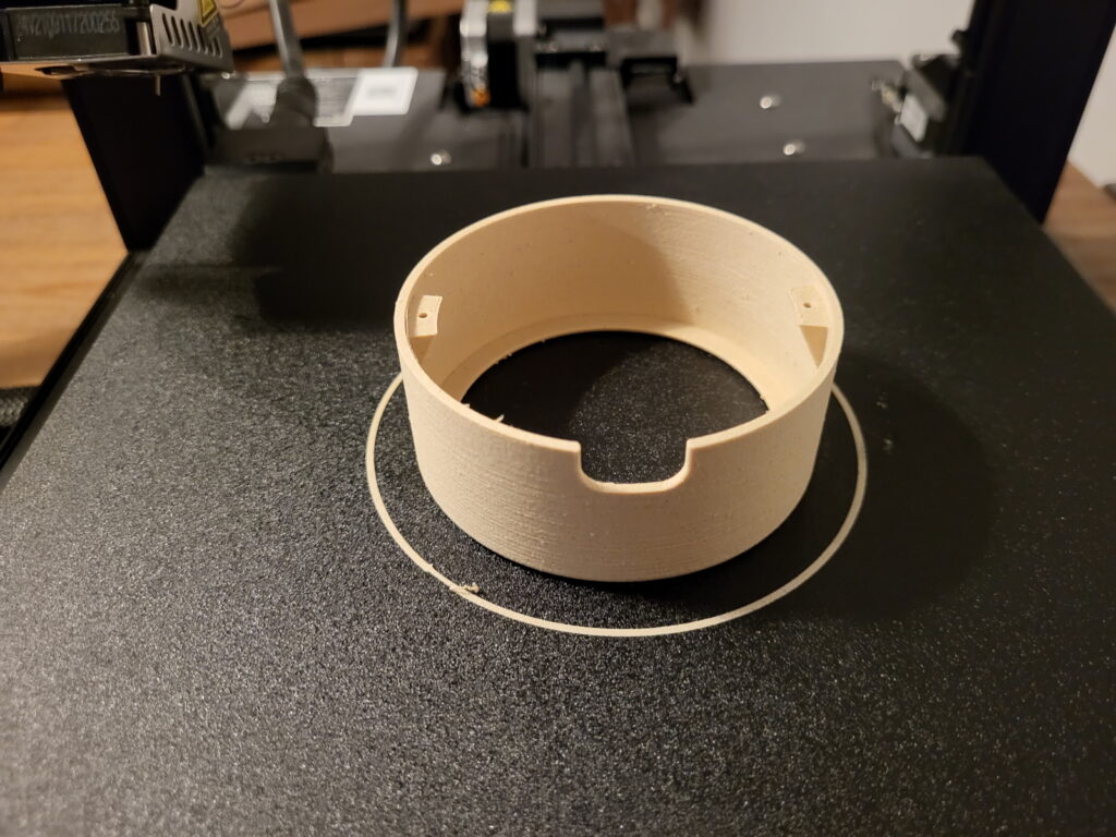
What has changed completely is the material of the main body. Originally as a prototype I used black PLA, it is still visible in the previous post. Black color is creating a lot of contrast and dragging too much attention though. As a next step I used a color that I imagine takes the least possible amount of attention and that is Khaki – usually used for camouflage. I do not have an image, but it was not very convincing. It’s hard to describe, it did fulfill the less-attention-dragging requirement, but it looked somehow dull.
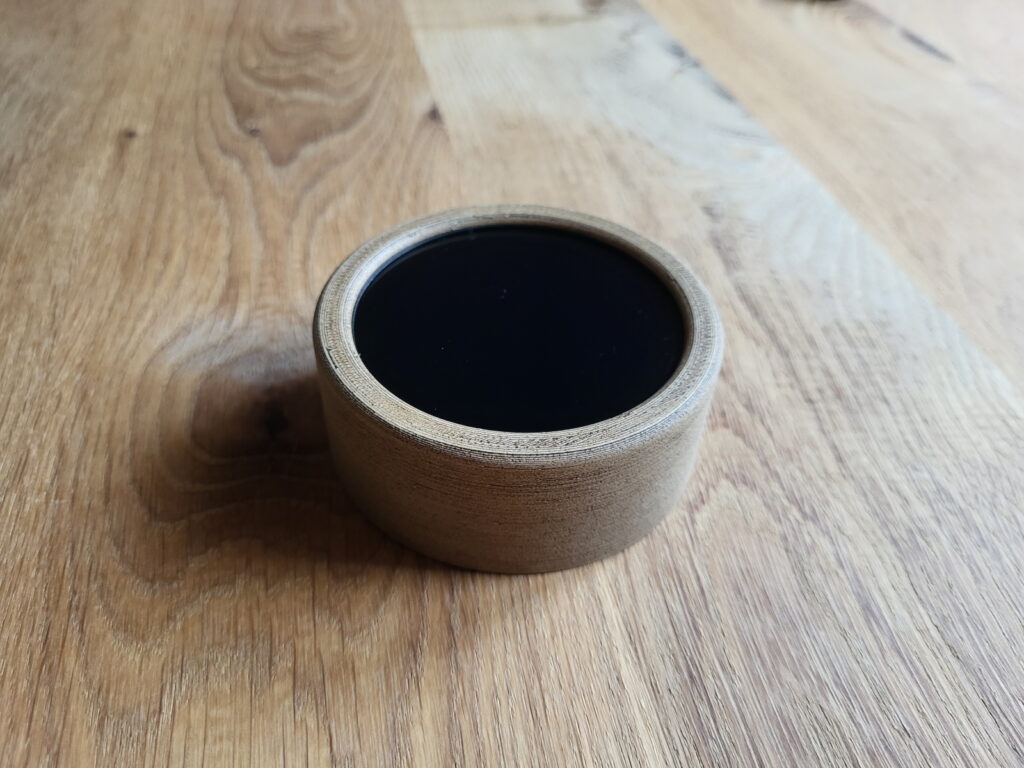
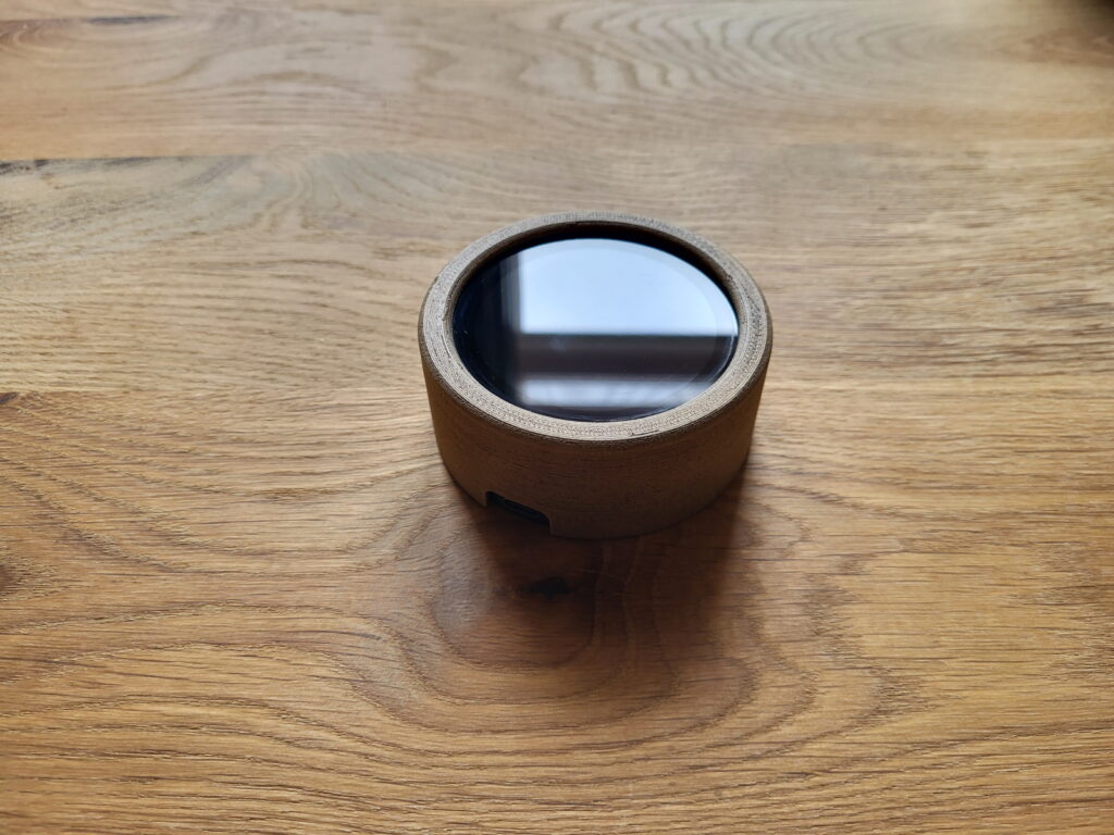
I always imagined that the ideal material to represent the spirit of Dice Device would be wood. But it seemed too difficult to achieve. Also there would be an impact either on size or robustness – Dice Device has relatively thin walls and wood is not that durable when it comes to thin layers. So I started to experiment with wood filament and subsequent surface cultivation with a wood stain. And the results exceeded my most optimistic expectations. Especially with the wood stain applied, the result is quite difficult to distinguish from a real wood. On touch it is basically impossible. And on look one has to inspect the object very carefully to spot the difference. Even the usual imperfections of 3D print play into our cards in this case – it looks like an annual rings of wood.
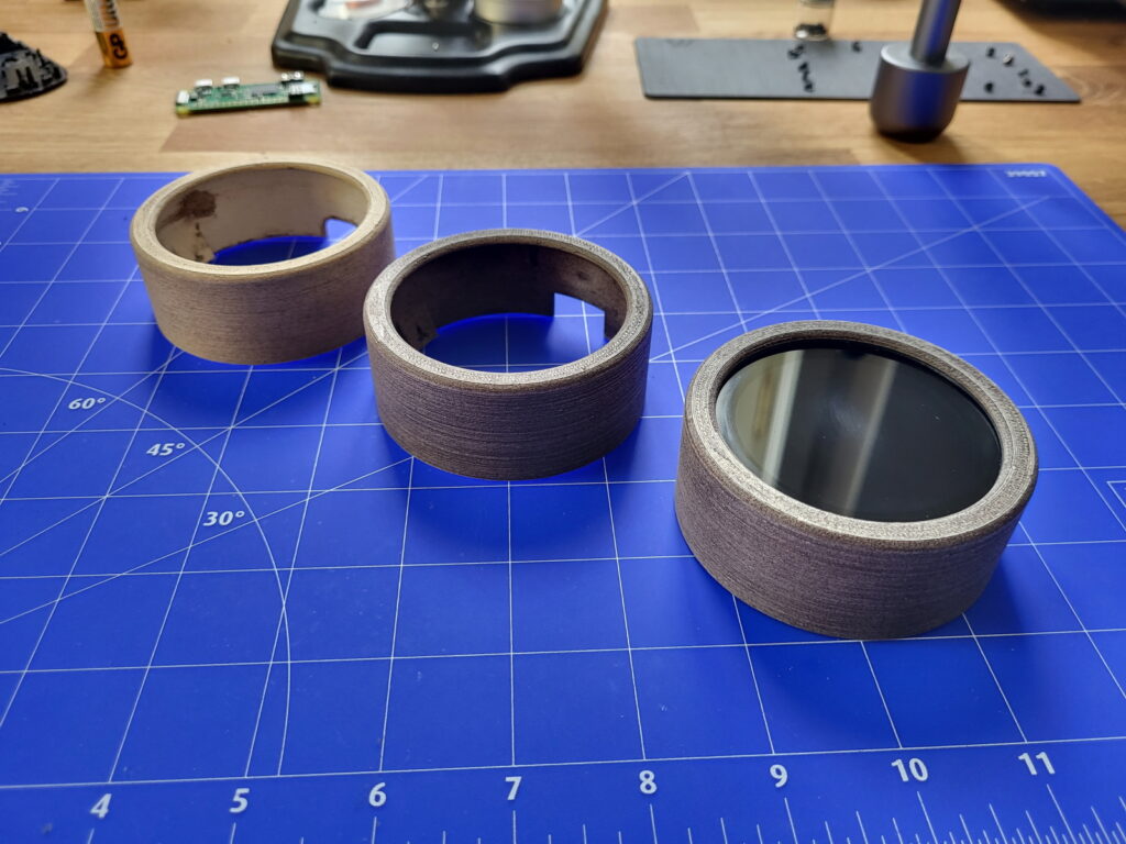
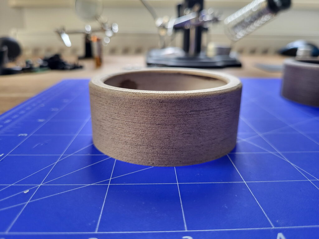
And this is the final result.

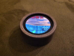
And just one more thing (as inspector Columbo would say) – guess what can also run on Dice Device… 🙂
